fall colours
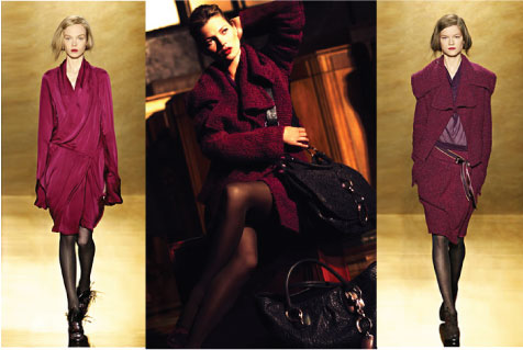
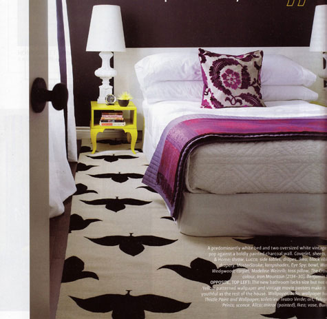
Whenever fall rolls around, a new version of purple comes out, just a hint of change from the previous year, or so it seems. Maybe it’s the color’s it’s paired with, but whatever it is, we are totally in love with this plum, mixed with a pinkish-red and almost flouro pink (the look, almost clashing).
We’re especially liking that lipstick on Kate Moss mixed with her plum-wine colored coat seen in those fall ads for Donna Karan. Room (above)from home of H&H merchandising designer, Emily Walker. The pillow from The Cross, Coverlet, House & Home, throw from Lucca (bedroom photo from H &H Makeovers 2008 magazine - photo by Donna Griffith).

Featured post
Exciting News! Poppytalk Has Moved!
Exciting news! I have taken the plunge and have moved Poppytalk onto Wordpress (well, a good portion of it anyway —many of the archive po...
Popular Posts
-
I like the idea of a jar of luck don't you? I was inspired after seeing this print by golly bard to create a real life one or two. ...
-
Alicia Bock Everywhere I turn, I'm seeing more and more artists responding to the disaster in Japan. It's incredibly heartwarming a...
-
Oh hi summer, let's get down to business. First off: vodka. Next: prosecco. Then: lemons. Finally: Pour. Ice. And again, please!...
-
Exciting news! I have taken the plunge and have moved Poppytalk onto Wordpress (well, a good portion of it anyway —many of the archive po...
© 2005 - 2021 Poppytalk. Powered by Blogger.
8 comments:
oh, i couldn't agree more - what a great piece. i absolutely love the shade of purple that's so hot this fall...like berry stains!
www.shoppingsmycardio.com
Oh I just love that rug!!
I know there's always disagreement over purple for interior design, but when it's this rich... I absolutely love it!
Very cool! I'm adding magenta to my tiffany blue and black room. I'll have to check out that pillow...
We're doing this shade of plum mixed with dark pink and tan in our living room so I was so happy to see this today to confirm what I was feeling a little insecure about. Thankfully my husband doesn't mind the feminine colors!
We went picking blackberries last night and we ate them with whipped cream - exactly the colour combination of the bedroom picture. That is SO gorgeous.
Those colors look amazing! Totally alive. Purple is a great color to work with and if you wanted to go with a softer tone, you could try a combo of a few different colors.
A few colors from the Valspar deck which come to mind are Lilac Lace, a soft rosy purple, Light Raffia, a light beige with a hint of green, and a color called Barely Pink which brings some grey to the pink. These colors make up a subdued palette that would be a great foundation for some of the bolder colors you suggested.
Check out the Color Buzz blog if you would like other subdued or bold color suggestions. We are happy to answer any questions you may have! colorbuzz.valsparblog.com
Lovely colors put together...
Pinks, Plums all goes well.
Post a Comment