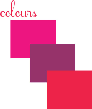
Whenever fall rolls around, a new version of purple comes out, just a hint of change from the previous year, or so it seems. Maybe it’s the color’s it’s paired with, but whatever it is, we are totally in love with this plum, mixed with a pinkish-red and almost flouro pink (the look, almost clashing).
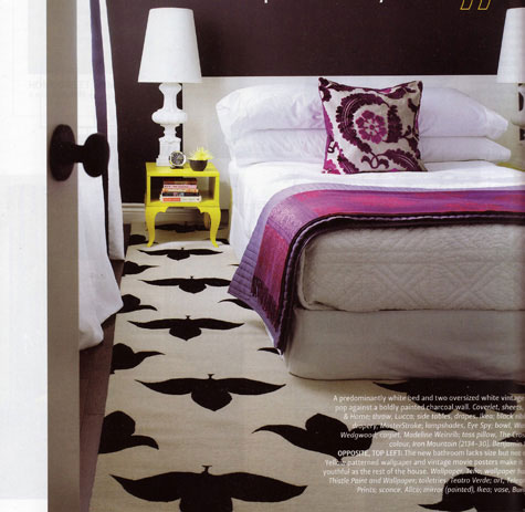
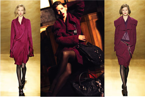
We’re especially liking that lipstick on Kate Moss mixed with her plum-wine colored coat seen in those fall ads for Donna Karan. Room (above)from home of H&H merchandising designer, Emily Walker. The pillow from The Cross, Coverlet, House & Home, throw from Lucca (bedroom photo from H &H Makeovers 2008 magazine - photo by Donna Griffith).
Comments
www.shoppingsmycardio.com
A few colors from the Valspar deck which come to mind are Lilac Lace, a soft rosy purple, Light Raffia, a light beige with a hint of green, and a color called Barely Pink which brings some grey to the pink. These colors make up a subdued palette that would be a great foundation for some of the bolder colors you suggested.
Check out the Color Buzz blog if you would like other subdued or bold color suggestions. We are happy to answer any questions you may have! colorbuzz.valsparblog.com
Pinks, Plums all goes well.