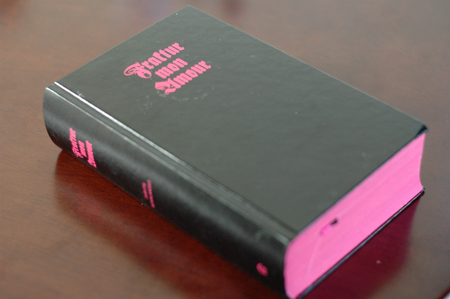
Like many of you out there, I have a love/hate affair with fonts. I belabor over type in much of my own work, and am often either drawn into or repulsed by the work of others because of the use of type. There is a vast intellectual discussion about type in the design world. The film Helvetica , for example, spoke volumes about how type affects our lives--even in ways we are not conscious.
When we love a font with all our heart, we might as well make a book about it--which is exactly what Judith Shalansky did. This Berlin-based graphic designer designed the 2008 homage to Blackletter/Gothic fonts, otherwise known as Fraktur.
Fraktur Mon Amor is Shalansky's homage to Blackletter. The book itself is 720 pages of gothic goodness, designed entirely in black and neon pink. Check out some of these images.
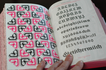
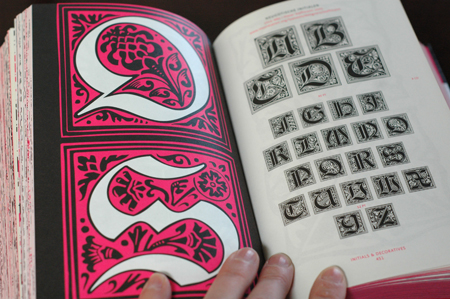
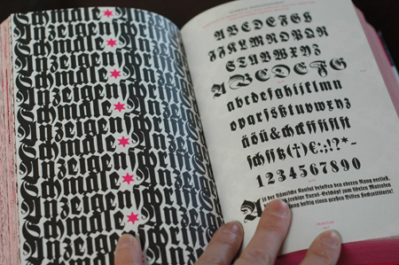
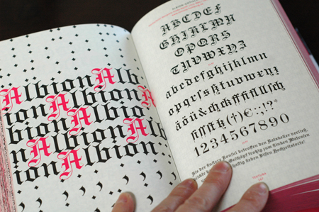
See the book in person and prepare for your breath to be taken away. Page after page of alphabets in every imaginable Blackletter typeface (333 to be exact!) along with stunning designs by Shalansky that use and accompany each alphabetic set and historical information about each.
Oh, and there's one more bonus: the book comes with a CD of 150 of the typefaces for free private and restricted commercial use.
Swoon.
Posted by lisacongdon.com



12 comments:
Some how she has made Blackletter/Gothic type faces look cool and modern. Genius! Makes me wonder how I could make a daggy typeface look hip.
wow, this is fabulous!
the pink spine is stunning!
I think I stopped breathing when I saw some of the pictures in your post. Amazing, thanks for sharing this.
They said never to judge a book by its cover, but when you take one look at that book, you know it's going to be interesting inside...and we're certainly not disappointed!
yeah, this book is GREAT!!! Go princeton arch press!
ah! and i thought i was the only one who has this chronically conflicted relationship with fonts!
So awesome! Thanks for sharing!
Wow, the best book review I have read in a long time! Thank you and cheers to a beautiful book! xoxo
That pink "S" is just amazing!
i've been eyeing this book for ages
looks incredible!
Post a Comment