
This week we’re really gravitating towards retro colours prominent in mid-century art, photography and furniture. Sort of subdued hues of turquoise, pinks and browns but updated with added brights almost fluorescent pinks and blues.
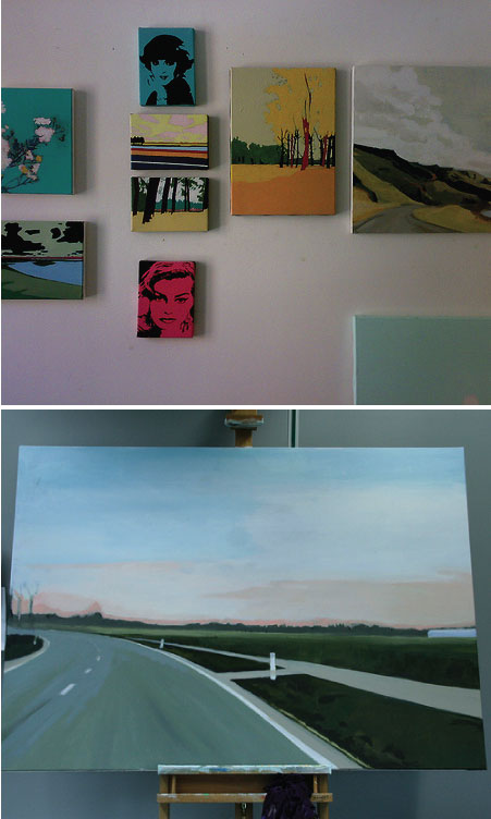
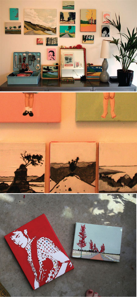
We noticed it first when we came across the work of Dutch painter, Rinske Dekker. Rinske studied at the Academy of Amsterdam to become an art teacher (however she liked art more than teaching, and we're glad she does!) She mainly use acrylics on canvas and her favorite tiny propelling pencil (2b) on paper, she also loves using color pencils. You can read more about Rinske over at Sfgirlbybay as an Unexpected Guest (last year). Her landscapes remind us of The Group of Seven. It’s a beautiful combination how she's added in the bright colors and we hope to see more mixes like this showing up in interiors near us soon! Rins can be contacted through her website, rinskedekker.nl or email her at eksnir[at]hotmail[dot]com.


3 comments:
yay!i have a huge grin on my face now. thanks so much : D
I just love this, such inspiring pics!
Lovely colours.
Post a Comment